
Introduction
A customer walks into a tire shop and faces a wall of 40 different tread patterns. Nothing is labeled by use case. Nothing explains why one tire costs twice as much as another. Many shoppers freeze, default to the cheapest option, or simply ask a staff member to "just pick one."
That's the problem a Good-Better-Best structure solves. Instead of an undifferentiated wall of SKUs, it organizes the assortment into three understandable value levels: a practical entry point, a balanced middle option, and a premium choice built for specific needs.
This article covers how to define those three tiers accurately, design a wall display that supports both self-guided browsing and advisor conversations, and roll the program out across multiple store locations without losing consistency.
Key Takeaways
- Build tiers around customer needs and use cases, not just price order
- Give every tier a clear use case, verified benefits, and honest comparison points
- Design for both self-service research and confident advisor conversations
- Prioritize durability, easy cleaning, and graphics that can be refreshed over time
Why Good-Better-Best Works for Tire Merchandising
Good-Better-Best works because it limits a complex decision to three meaningful options instead of dozens of similar-looking ones. Bain & Company's pricing research describes the structure as adding or removing features to create distinctly priced bundles for different customer priorities (Bain & Company, 2019). The top tier can even change how shoppers perceive the middle option.
There's also a behavioral reason the middle tier tends to perform well. Research on consumer choice by Simonson and Tversky found that a mid-range option often looks more attractive when it sits between two extremes (Simonson & Tversky, 1992). They called that pattern extremeness aversion. That's a documented decision-making tendency, not a guaranteed sales lift for any specific tire wall.
What Each Tier Should Actually Represent
For tires specifically, the three levels typically map to:
- Good – A budget-conscious option for drivers prioritizing cost over extras
- Better – A balance of features, ride comfort, and price for everyday drivers
- Best – A specialized choice for performance, longevity, winter capability, or extended warranty needs
Every label needs backup. Wet-braking, treadwear, winter traction, load and speed ratings, and warranty terms should come from manufacturer documentation or NHTSA's UTQG system (NHTSA, 2016).
UTQG grades treadwear, wet traction, and temperature resistance for covered passenger tires. Those treadwear numbers are comparative, not a promised mileage figure—so don't present them as a guarantee.
A tire wall can also support what's already happening in the service bay. When an advisor is explaining tread wear or recommending a replacement, a nearby display gives them something physical to point to. Automotive service education displays built around tire-tread samples let advisors show, not just describe, what's changing on a customer's vehicle.
That same proof-on-the-wall idea scales when the assortment changes. A commuter sedan display might emphasize fuel efficiency and ride quality across its tiers, while an SUV or truck wall shifts toward load capacity and all-terrain capability. A seasonal tire section does the same thing with winter traction instead of daily commuting comfort.

How to Define the Good, Better, and Best Tiers
Assigning real products to each tier takes more than sorting by price. Start with a framework that weighs:
- Customer priorities (budget, comfort, longevity, performance)
- Vehicle application and common tire sizes for that store's customer base
- Seasonal demand and regional driving conditions
- Inventory availability and margin targets
- Manufacturer positioning for each product line
Those inputs set the boundaries. Inside them, the middle tier usually needs the most deliberate work.
The "Better" tier needs the most care. The middle option is the easiest one to get wrong. If it feels like an arbitrary in-between choice, customers won't trust it.
Position "Better" as a deliberate answer for a specific driver, such as a daily commuter who wants quieter rides and longer tread life without paying for performance features they'll never use.
Keep each tier focused. Three to five representative products per tier is plenty. Customers who need a specific size, a special order, or a less common fitment should be directed to an advisor rather than searching the wall themselves.
Every tier's signage should answer the same core questions:
- Who is this tire built for?
- What are the two or three main benefits?
- What are the real limitations?
- What's the warranty or mileage expectation, if verified?
- Where can the customer get installed pricing?
Avoid framing "best" as an absolute safety claim. It should mean the best fit for a defined need, supported by current manufacturer documentation, not a blanket statement that outranks every other tire in the building.
Designing an Effective Good-Better-Best Tire Wall Display
The wall itself needs to create instant visual hierarchy. Three clearly separated zones, consistent color coding, and simple iconography let a customer understand the structure before reading a single word of copy.
Content Order Matters
Within each zone, information should flow in this order:
- Tier label (Good, Better, Best)
- Customer use case ("Daily commuting," "Family SUV," "Winter performance")
- Two or three verified benefits
- Product examples or tread samples
- A clear next step, such as "Ask about fitment and installed pricing"
Physical Elements That Make It Tangible
Chicago Show's tire display programs lean on mounted tires, cutaway tread sections, and sidewall samples to make the comparison physical rather than purely visual.
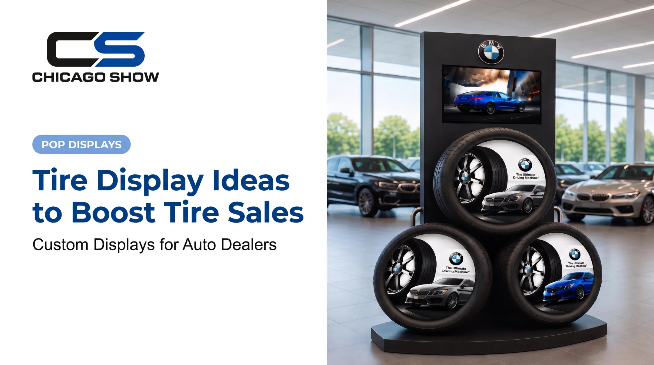
One version arranges three full tires in a triangular formation alongside wheel and vehicle branding, giving customers something to walk up to rather than just read about. Another—a motorcycle tire counter display for Dunlop's Geomax MX33—pairs a cut tire section with rebate messaging so the value proposition and the physical product sit side by side.
Keep display-only pieces and touchable samples clearly marked. Mounted hero tires typically stay fixed; tread cross-sections and sidewall swatches can usually be handled.
A few practical build requirements matter as much as the graphics:
- Wall dimensions and sightlines that work with existing customer traffic flow
- Mounting hardware rated for actual tire weight, not just graphic panels
- Cleaning access, since tire walls collect dust and rubber residue quickly
- Accessible routes to the display, with shelving placed so customers using mobility devices can reach it
- Lighting that doesn't wash out tread detail or sidewall text
- Graphics that can be swapped when products or pricing change
Tone, Education, and Staff Support
Visual contrast should separate the tiers without making "Good" look like the discount bin or "Best" look like the only acceptable option. Neutral language works better than pressure tactics. "Built for budget-conscious drivers" lands better than "entry-level" or "basic."
A nearby hands-on area—new tread next to worn tread—reinforces the message without overstating what the wall can do. A wall display is a reference tool, not a diagnostic one; actual tread depth and wear still need a technician's inspection.
Printed or digital signage should answer the questions customers ask before a staff member is free:
- Which tire fits my car?
- What's actually different between these three?
- Is installation included in that price?
Advisors benefit from the same structure. A short talk track that starts with driving needs and fitment, walks through the three options, and ends with a clear recommendation keeps conversations consistent across staff.

If you add QR codes to spec sheets or financing details, maintain them like any other signage. A code that points to outdated pricing or a dead link damages trust faster than having no digital element at all.
Planning the Display Program for Multiple Locations
A single wall is one project. Fifty locations is a program, and it needs standards.
What Stays Consistent Everywhere
- Tier definitions and the criteria behind them
- Approved messaging and brand guidelines
- Color system and typography
- Product-data fields and safety requirements
- Measurement and mounting specifications
What Can Flex by Location
- Available tire sizes and seasonal mix
- Store footprint and wall dimensions
- Local pricing and promotional timing
- Language, where relevant to the market Those standards only hold if every location follows the same rollout path. Chicago Show's process maps five stages onto a multi-location tire program:
- Understand the program's scope
- Review specifications and constraints in detail
- Manage production from first article through full run
- Manage delivery through kitting and pack-out
- Support the program after launch with refreshes and reorders A practical rollout checklist covers:
- Site surveys
- Design approval
- Prototype review before full production
- Kitting and pack-out
- Scheduled delivery and installation
- Staff training
- Post-launch inspection to confirm units arrived and mounted correctly Recurring support matters more than most retailers expect. Graphic refreshes, product swaps, reorders of worn components, and phased rollout waves all run smoother when one point of contact keeps program history instead of starting from scratch each time. For measurement, track operational signals rather than guessing at targets:
- Display condition during store visits
- How often staff use the wall in customer conversations
- Questions customers ask at the display
- Quote activity by tier
- Whether product availability matches what's on the wall No published data sets a universal conversion benchmark for tire walls. Build your own baseline from these indicators instead of borrowing a number from an unrelated industry.

Common Mistakes to Avoid
Even a well-designed concept can fail in execution. The most frequent issues:
- Too many products, no clear system. A wall crammed with every SKU in stock defeats the purpose of tiering.
- Vague or unsupported labels. Claims like "best tire on the market" without documentation erode trust fast—especially with buyers who research before they shop.
- Missing installed-price direction. If the wall doesn't point customers toward what the final price includes, they'll assume the sticker price is the whole story.
- Inconsistent product data. Outdated warranty terms or mismatched tread specs between the wall and the sales system create confusion at the counter.
- Poor physical fit. A display that blocks walkways, is hard to clean, or can't handle shop conditions looks tired within months, even with strong day-one graphics.
Schedule regular reviews. Worn tread samples, outdated graphics, discontinued products, and damaged hardware creep in over time. Staff feedback is often the fastest way to catch these problems before a customer does.
How Chicago Show Can Support a Custom Tire Wall Display Program
Chicago Show has helped companies present products well since 1902. That same focus now supports custom display programs for tire retailers, auto parts chains, and dealership networks across the country.
A full program can cover:
- Concept development and in-house engineering
- Materials specification and production management
- Kitting, fulfillment, and quality oversight
- Ongoing support after launch, including refreshes and reorders
A Good-Better-Best tire wall does not need to treat every location the same way. Programs can flex around:
- Store footprints and product quantities
- Retail environment and fixture constraints
- Rollout timing and recurring refresh schedules
That holds whether you are outfitting one flagship store or running a multi-year rollout across a dealer network.
Tire retailers, automotive brands, distributors, and marketing agencies can work with Chicago Show on planning, materials, and rollout logistics tied to their footprint and timeline. Start a project to see how a custom program could fit your locations.
Frequently Asked Questions
What is the 3 rule for tires?
It means offering three tire choices in a Good-Better-Best structure instead of an overwhelming full assortment. The display should still account for vehicle fitment, safety, manufacturer guidance, and the customer's actual driving needs.
Which tires have the best-looking sidewall design?
Sidewall appearance is subjective and shouldn't outweigh fitment, performance, condition, or warranty coverage. Use sidewall samples on the display as a visual reference point, not as a quality ranking system.
What does good, better, best mean for tires?
The three tiers represent customer-focused levels of features, performance, use case, and price. "Best" doesn't mean universally superior; it means the best fit for a specific driver's needs.
How should tires be arranged on a display?
Arrange tires in clearly separated tiers with readable labels, verified comparison points, and a few representative products per tier. The layout should guide customers from their use case toward a conversation with an advisor—not force them to decode the wall alone.
What information should a tire display include?
Include the intended use case, two or three verified benefits, relevant limitations, fitment guidance, warranty details where applicable, and direction toward installed pricing. Always include a clear next step for the customer to take.