
Introduction
A good retail display does more than fill empty floor space. It helps a shopper notice a product, understand what it does, compare it against alternatives, and decide to buy it — all in the few seconds they're willing to spend looking.
That's harder than it sounds. Many brands and multi-location retail teams struggle with tight floor space, overcrowded assortments, and displays that look great in a planogram photo but fall apart after three weeks of real store traffic. Add inconsistent execution across dozens or hundreds of locations, and even a well-designed program can underperform.
This guide covers what actually makes a display work: proven merchandising ideas, how to match display type to product and store, how to build a program you can repeat across locations, and how to measure whether it's paying off.
Key Takeaways
- Every display should drive one clear shopper action: discover, compare, try, learn, or add to cart.
- Strong displays pair visual hierarchy with useful information, logical grouping, and breathing room.
- Fixture choice depends on product weight, interaction level, replenishment needs, and program length.
- Run display execution as an ongoing program covering production, fulfillment, QC, and refreshes.
What Makes a Retail Display Effective?
An effective display shares a few traits:
- Visible and relevant to the shopper in front of it
- Easy to understand at a glance
- Physically accessible
- Consistent with the brand
- Built to last
- Clear about the next step
Miss any one of these and performance suffers, no matter how polished the design looks.
Visual Hierarchy Does the Heavy Lifting
Shoppers don't read a display. They scan it. Hierarchy tells their eyes where to land first.
Height matters more than most merchandisers assume. A 2021 in-store eye-tracking study published in the Journal of Marketing Research found the strongest pull on shopper attention sat roughly 14.7 inches below eye level, not at eye level as conventional wisdom suggests.
That's worth testing before you finalize where your headline or featured product sits on a fixture.
Beyond height, hierarchy relies on:
- Contrasting scale between hero and supporting products
- Color blocking that separates one message from the next
- Negative space so nothing feels cramped
- Lighting that highlights the focal point
Turn Products Into a Story, Not a Shelf
A single product on a stand is forgettable. A product shown solving a problem sticks.
Chicago Show's work for Monroe Shocks & Struts illustrates this well. Rather than only showing boxed parts, the interactive counter unit puts a miniature suspension assembly under a clear dome.
Messaging such as "Feel the Difference," "Improve Control and Handling," and "Reduce Premature Tire Wear," plus a 1,000-mile, 90-day risk-free trial, turns the product into a demonstration instead of inventory.
The same principle applies across categories:
- A Goodyear timing-belt unit mounts real components (cam gear, tensioner, water pump) on an illustrated engine panel and recommends replacement every 60,000 to 100,000 miles
- A Behr paint sample center pairs cans with color swatches and room imagery on tiered shelving so shoppers can compare before committing
- A Lowe's checkout setup wraps a Pepsi cooler with snacks, candy, and bottled water for last-second impulse adds
Design for the Shopper's Real Questions
Before a shopper buys, they're silently asking: What is this? Who's it for? How does it work? Why this one over the alternative? What else do I need?
A display earns the sale by answering these without forcing the shopper to hunt for a salesperson. Clear product cards, short benefit statements, and visible differentiators do more work than dense paragraphs of copy ever will.
Build It to Survive the Field
A display that looks perfect on day one but can't survive restocking, cleaning, or three months of foot traffic is only temporary decoration. Stable construction, accessible product fit, and simple restocking instructions matter as much as the graphics.
Test one variable at a time. A 2023 field experiment published in the Journal of Retailing compared a conventional endcap with moderately and highly vivid projected versions.
The moderate version drove 18% purchase conversion versus 12% for both the conventional display and the highly vivid one. More visual intensity did not automatically win; it had to be tested.

Retail Display and Merchandising Ideas to Try
Build these formats into your merchandising plan—and keep each one focused on a single shopper job.
Entrance and power-wall displays. Use the first few feet of the store for new, seasonal, or high-margin products. Give shoppers a reason to keep walking in, not only a reason to stop.
Endcaps and floor displays. Tell one product story per endcap. Stock enough to avoid empty gaps, but don’t add a second or third message—overcrowding kills conversion.
Cross-merchandising displays. Group complementary products around a task instead of a category. Examples:
- Vehicle maintenance: wipers, fluids, and a Monroe shocks display together
- Home improvement: paint, brushes, and tape near the Behr sample center
- Entertaining: snacks and beverages at checkout, as seen in Lowe's Pepsi cooler build
Hands-on and demonstration elements. Touch-and-test lifts conversion, but only with a plan for staffing, safety, replenishment, and theft. The domed Monroe suspension display lets shoppers interact without handling loose parts.
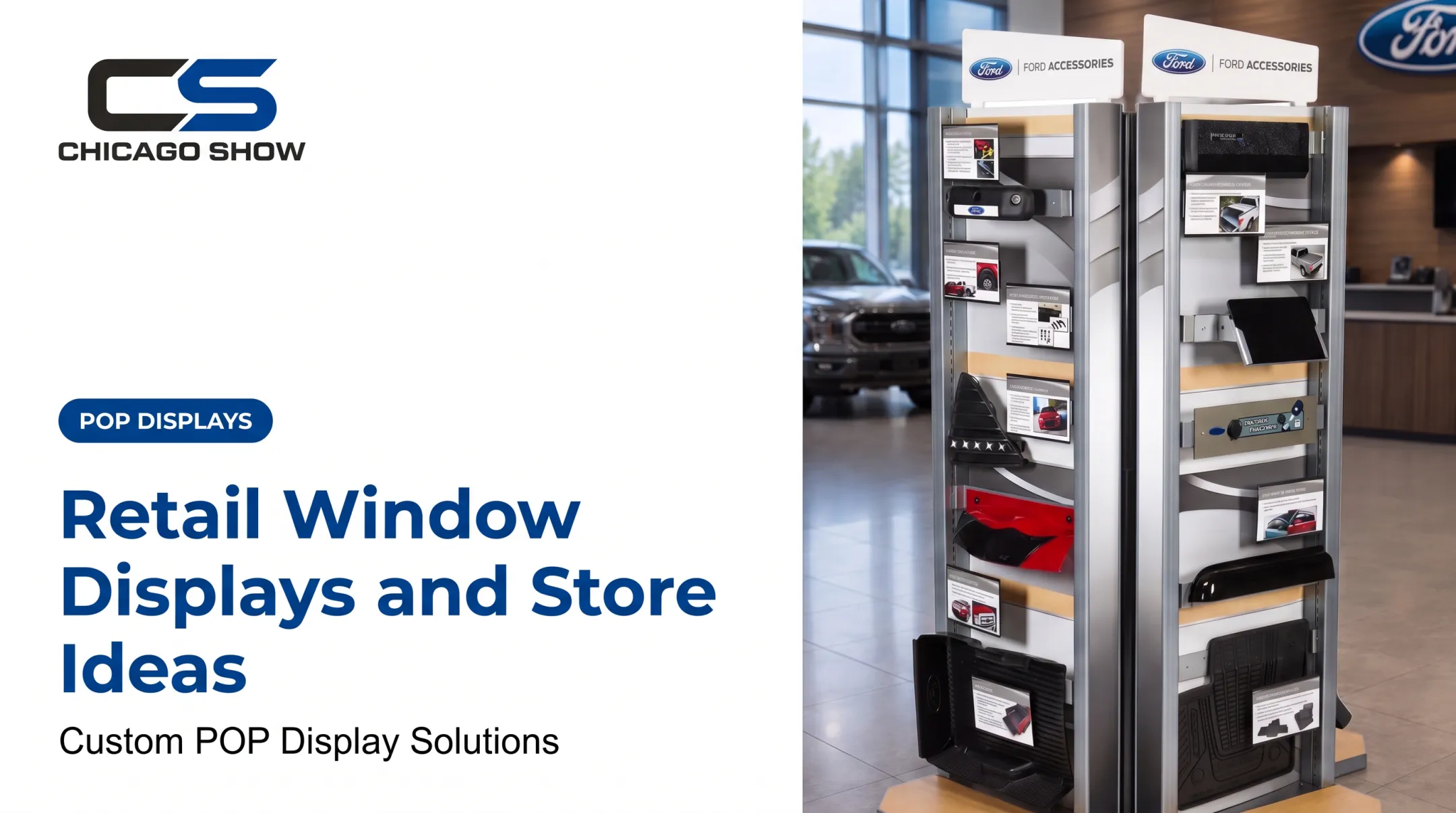
Vertical merchandising. Wall units, risers, pegboards, and tiered shelving multiply footprint without adding floor space. Chicago Show’s wall-mounted accessory systems use modular panels that flex by store size.
Seasonal and launch displays. Lock a color palette, signage system, and changeout schedule. Build a calendar instead of chasing every trend claim.
Interactive and connected elements. QR codes to install steps, reviews, or video cut shelf uncertainty on technical products. Tie each link to one question the shopper is already asking.
Mistakes to Avoid
- Overloading the display with too many messages
- Letting signage go stale or peeling
- Blocking product access with oversized graphics
- Inconsistent branding across locations
- No clear next step for the shopper
Choose the Right Display Type for the Store and Product
Not every display format fits every product. Match the fixture to how shoppers interact with what's inside it.
| Display Type | Best Use Case | Limitation |
|---|---|---|
| Counter display | Small, high-margin items near checkout; rebate or promo messaging | Limited space for storytelling |
| Floor/freestanding display | Standalone product launches, demos, bulkier items | Needs clear floor space and sightlines |
| Endcap | Category spotlight, seasonal push | Easy to overcrowd; needs frequent restocking |
| Wall-mounted display | Accessories, parts, products needing tiered visibility | Fixed location limits flexibility |
| Window/entrance display | First impression, brand storytelling | Not suited for high-touch or heavy items |
A 2022 Journal of Retailing analysis of 42 weeks of transaction data at a large U.S. grocery chain found front endcaps had the strongest effect on category purchase. Shelf displays carried more weight on brand choice.
Location and format are separate decisions. Each one shapes a different part of the buy.
Format should also follow the product itself:
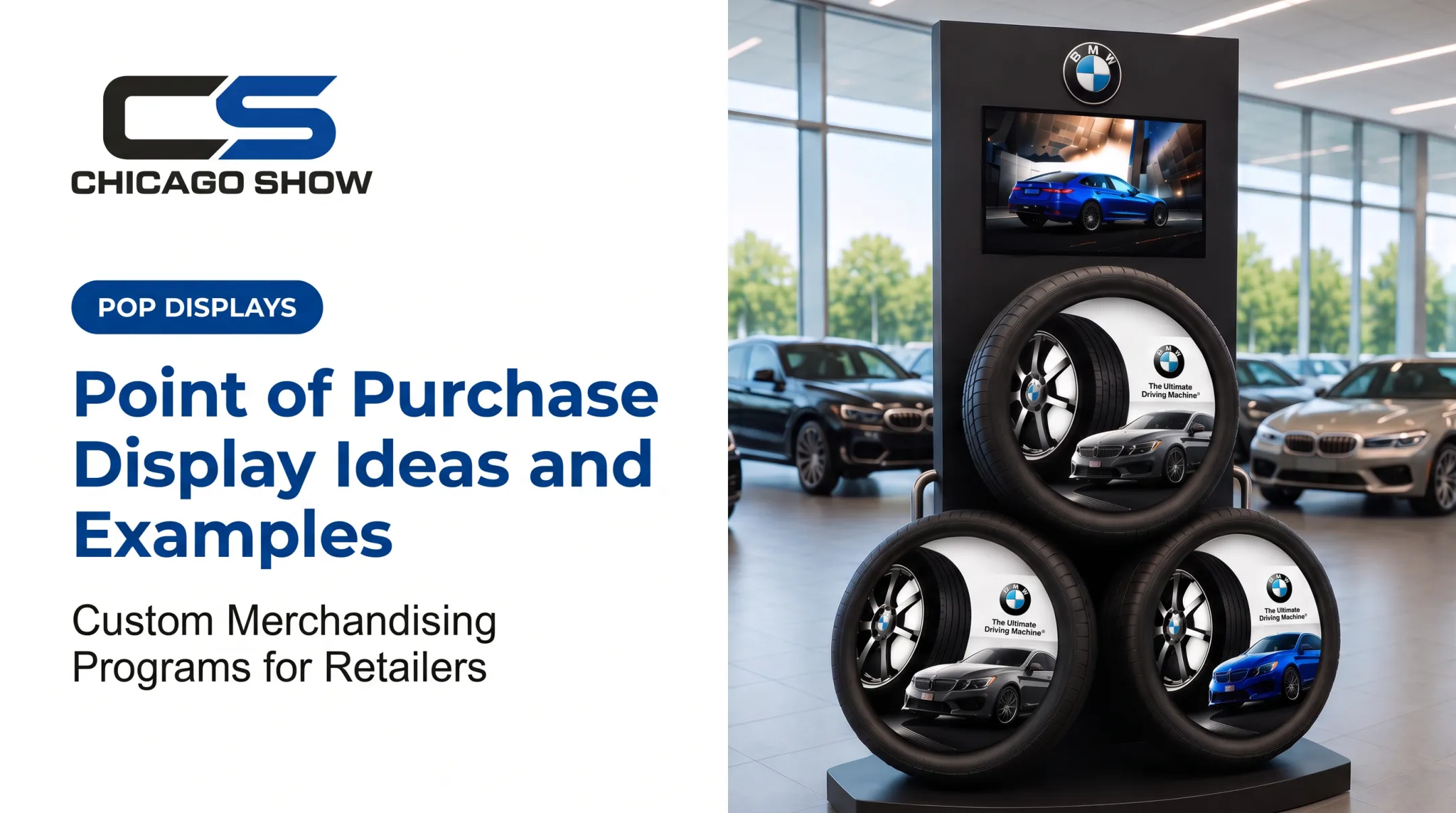
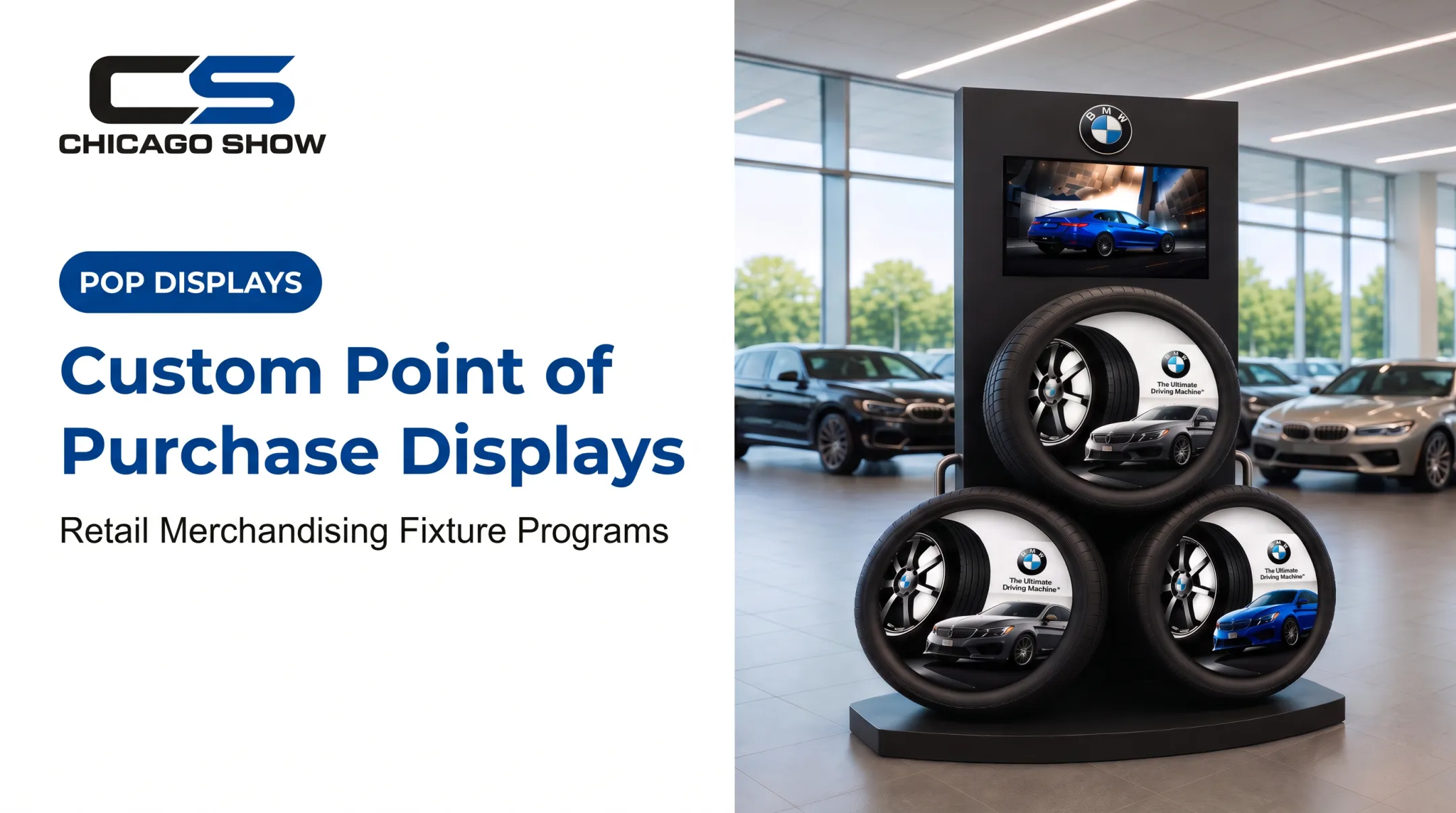
- Weight and footprint: A freestanding BMW tire display built for a dealership showroom can carry three large tires; a countertop unit can't.
- Interaction level: Hands-on units, like the Monroe demo display, need accessible, durable housing.
- Security: High-value or small items may need locked or tethered fixtures.
- Replenishment frequency: Fast-moving products need easy-access restocking, not decorative packaging.
Small Stores and Multi-Location Programs
Small-footprint stores benefit from vertical fixtures, nesting tables, and rotating feature zones that swap products without swapping the fixture itself. Edited assortments beat crowded ones every time.
Once the format fits the product, multi-location and dealer programs still need that same fixture to repeat cleanly. Consistency is the goal:
- Standardized dimensions across locations
- Modular components that adjust to different footprints
- Repeatable graphics for brand consistency
- Clear assembly instructions store teams can follow without a rep on-site
How to Turn an Idea Into a Repeatable Display Program
A good concept only matters if it survives contact with real stores, real shipping, and real store teams.
- Write the brief first. Lock the goal, shopper, products, and success metrics before anyone sketches.
- Store environment, locations, and dimensions
- Quantity, budget, and timeline
- Brand standards and compliance needs
- Move through development in sequence. Concept and rough layout, material selection, engineering, prototype review, production, packaging, delivery.
- Design for the field, not the photo. Specify materials for expected wear, make products easy to load, and account for shipping and assembly realities.
- Run quality-control checkpoints. Check dimensions, graphics, color accuracy, structural stability, product fit, hardware, labeling, and pack-out before anything ships.
- Pilot before full rollout. Test in a representative store, gather feedback from shoppers and store staff, fix what doesn't work, and lock down final specs.
Once specs are locked, execution still has to hold up across every location. Chicago Show has managed custom display programs since 1902, working with brands including U-Haul, Kia, Ford, Monroe, and Lowe's to take concepts from sketch to shelf.
Support typically covers:
- Materials specified for each store environment
- In-house engineering and production oversight
- Quality checks against spec before units ship
- Kitting, pack-out, and fulfillment so complete units arrive consistently
For recurring programs, the first rollout is rarely the hard part. The second, third, and tenth are. Reorders, refreshes, and rollout waves run against retained program history instead of starting from scratch each time.

How to Measure and Improve Display Performance
A display program without measurement is just a guess repeated at scale.
Start with a baseline and a primary objective. Decide upfront whether you're measuring discovery, trial, conversion, attachment sales, basket size, sell-through, or education before launch, not after.
Track metrics with clear definitions:
- Sell-through rate: units sold ÷ units received × 100
- Attachment/cross-sell rate: transactions with both the focal item and an add-on ÷ transactions with the focal item
- Inventory turnover: how often stock sells and gets replaced in a set period
- Basket size: total items sold ÷ total transactions
- Shopper interaction: QR scans, sampling participation, demo engagement
Compare test versus control. Run the same display in similar stores, one with the change and one without, while accounting for seasonality, pricing, promotions, and traffic differences. This isolates what the display is actually doing versus what the calendar is doing.
Audit regularly. Field conditions drift from the pilot. Check:
- Cleanliness and product availability
- Signage condition and lighting
- Structural stability and placement
- Match to the intended plan
A perfect display that's dirty, half-empty, or moved to a bad aisle won't perform like the pilot version did.
Act on the findings. Use what you learn:
- Refresh graphics or revise messaging
- Adjust quantities or relocate the display
- Fix the fixture, or retire it

Not every display deserves a second life — and that's fine.
Frequently Asked Questions
What are some good merchandising ideas?
Themed groupings, task-based cross-merchandising, seasonal feature zones, demos or sampling stations, vertical displays, and educational signage work well when matched to the product and store traffic pattern.
What are some unique retail display ideas for stores?
Try interactive comparisons, unexpected scale (like an oversized tire cutaway), modular fixtures that reconfigure by season, sensory elements, and shoppable QR content tied to a specific shopper question.
What makes a good retail display?
Visibility, simple messaging, relevant product grouping, accessibility, brand consistency, durability, easy replenishment, and a clear next action for the shopper. Miss durability or replenishment and the rest won't matter after week two.
What are the 5 types of displays with examples?
Counter displays (checkout rebate offers), floor/freestanding displays (showroom tire units), endcaps (seasonal category pushes), wall-mounted displays (accessory merchandising), and window/entrance displays (brand storytelling at the door).
What are some good ideas for a small retail store?
Vertical fixtures, rotating feature zones, risers, nesting tables, and edited assortments create impact without crowding limited floor space. Pick displays that serve more than one merchandising purpose where possible.
What are the hottest retail trends right now?
Interactive in-store content, personalization, flexible modular fixtures, and measurable display performance lead current retail trends. Adoption still varies by category and retailer size.